Why have we rebranded?
The Institute of Cancer Research, London, has an outstanding record of achievement going back over 100 years, and has been involved in some of the most important discoveries in the history of cancer research. But we need to do more to promote ourselves within the UK and globally to ensure we maintain our position as one of the world’s most influential cancer research institutes. Our new branding is an important part of our identity, and is designed to help get across to our various audiences the world class nature of our science, and its benefits for patients.
How did the rebranding come about?
When Professor Alan Ashworth took over as chief executive of The Institute of Cancer Research (ICR), a year and a half ago, he decided we needed to better articulate what it was that made the organisation unique. We launched an identity project and developed a new mission statement – making the discoveries that defeat cancer – and a set of supporting statements which describe who we are and what drives us to be so successful. When that work was complete, we moved on to looking at how we present ourselves visually to support our verbal identity statements.
Why now?
The world of cancer research is incredibly competitive, and we cannot stand still. The ICR needs to stand out, to make the most of our unique bench-to-bedside approach – so we are in the best position to achieve our mission. We therefore felt we needed to begin work to enhance the ICR’s reputation right away, to help us draw in funding and attract the very best staff and students – the bright minds we need to make the discoveries that defeat cancer.
How was the new brand developed?
The ICR commissioned leading brand consultant Saffron to lead the year-long project to reshape its visual identity. Saffron, whose clients include KPMG and Visit London, drew out imagery from the ICR’s own research intended to capture the organisation’s scientific excellence and its focus on patient benefit. The ICR consulted on Saffron’s concepts with a cross-section of its 1,000 staff and students, plus supporters and partner organisations.
How did you arrive at the concept?
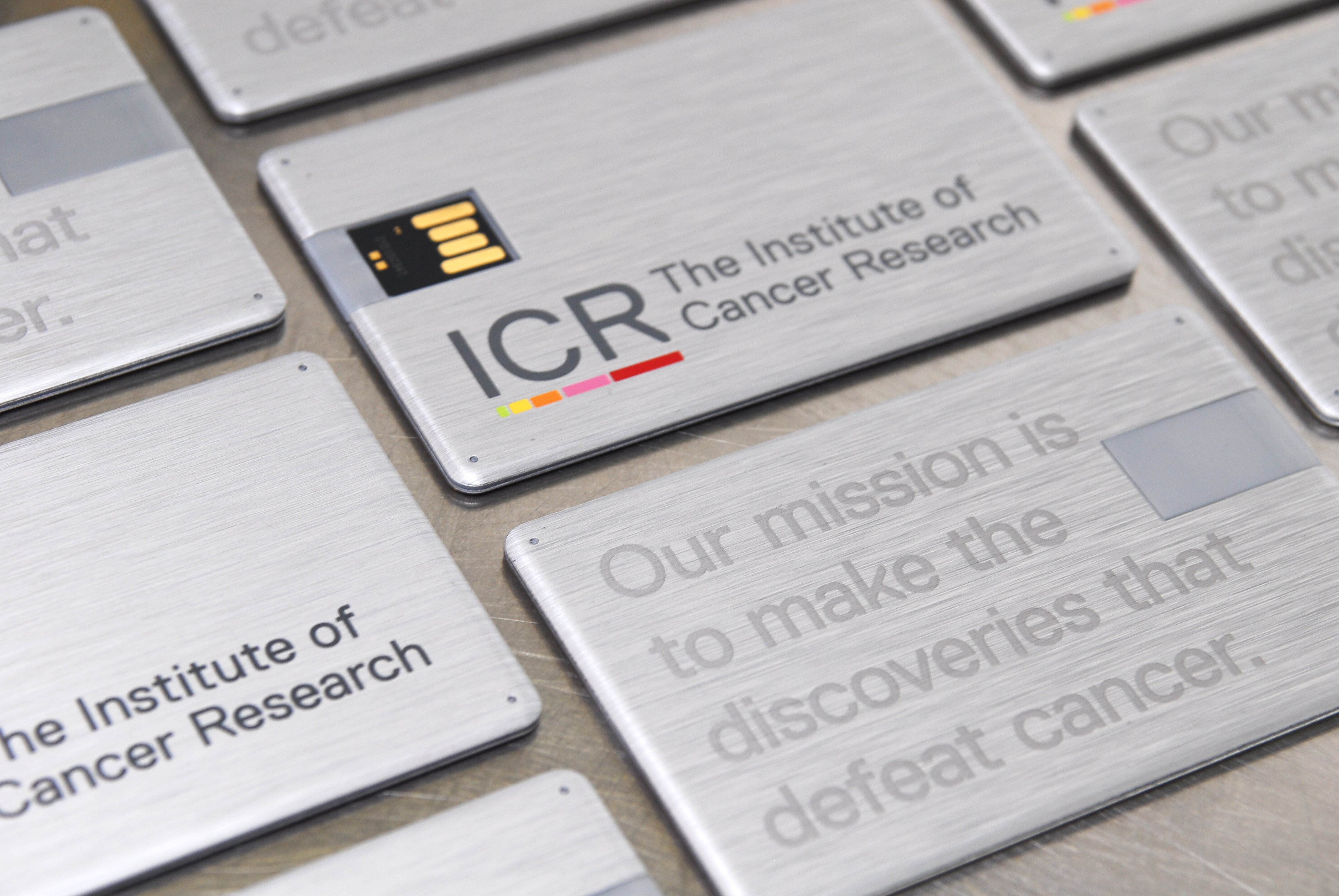
Our verbal identity stresses the theme of discovery for patient benefit. Our new visual identity is intended to reinforce this theme. The coloured bars below the ICR’s name are intended to reflect images found in our scientific and medical research – the band on a gel, stained sections of chromosomes or drug capsules. The bars also increase in size in proportion to the mathematical Fibonacci sequence - helping to convey together with the optimistic colour palette a sense of progress, discovery and innovation.
What is the Fibonacci sequence?
The Fibonacci sequence is a set of numbers beginning with 0 and 1, where each subsequent number is the sum of the previous two - 0, 1, 1, 2, 3, 5, 8, 13, 21, 34, 55… It is a pattern that commonly occurs in nature, for example in the arrangement of a pine cone or during cell division.
How will the new identity benefit the ICR?
Our ambition is to raise £100m by 2020. That will require a significant step up in our fundraising capabilities, which will only be possible with the much stronger identity that our new branding gives us. In addition we believe our brand identity will be a significant help in our efforts to recruit world class staff and students, and to develop partnerships with the best organisations around the world. Those benefits are hard to quantify, but are likely to be very substantial.
