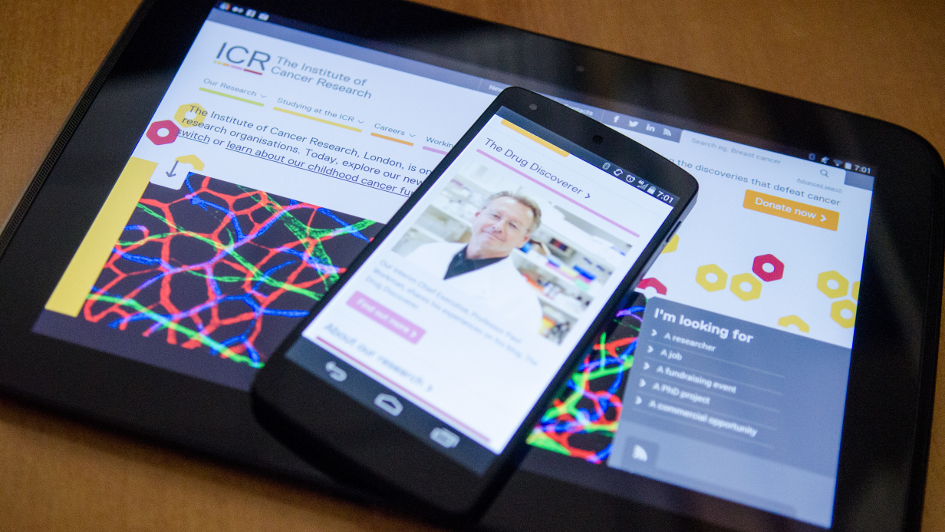
We’ve spent the last year rethinking, redesigning and rebuilding our site – using a new technical platform and with a look intended to really sell our world-class science.
What you’re looking at is the result.
Launching a brand new website on a new technical platform is a big job and I wouldn’t necessarily recommend it as a means of relaxation.
But we knew we needed to do it, because we wanted more from our site – we wanted it to be as modern, dynamic and forward-looking as we are.
The Institute of Cancer Research, London, is one of the great cancer research organisations. Our roll call of discoveries includes many of the early chemotherapies, DNA damage as the cause of cancer, targeted radiotherapy and the BRCA2 gene.
Our achievements are respected in scientific circles across the world, but we know there’s work to do to get that greatness across to the wider world.
And of course, a big part of that is a really excellent website – one that looks state-of-the-art and modern, that works as a communication tool, and that befits a high-tech organisation with some of the best scientific facilities in the world.
I'll leave you to judge whether we’ve achieved that – I hope you'll feel we have. Certainly, the site gives us a platform to write about, film, photograph and converse about the research we’re so proud of, and all the benefits for patients it brings.
Not only the research, either. It was clear in our discussions about the site that we needed to do a better job of conveying the full range of our functions – as a research institute, university and charity – and the people who make them happen. Our new site has the science at its heart, but it talks too about our vital educational, fundraising and commercialisation work.
My background is in journalism, and when we discussed the new website, I and others in the team were keen to bring a little from the dynamic, interactive sites of media organisations.
One of the insights those media sites have given us over recent years has been just how opportunistic much web traffic is. Yes, people often search for what they want to read about and go straight to it, but where they go from there is determined by a combination of whim, and what interesting material is placed on front of them.
And by interesting, I mean interesting to them, at that moment. So someone who has visited our site to read about a radiotherapy project may find the latest news in that area appealing. A supporter donating to us online may want to know about our latest fundraising activities. The key is to match the interest with the content.
So our site borrows its set-up in part from media organisations. It communicates about the ICR’s work using new dedicated web pages, news stories, blogs, features and videos, and tags articles by topic so they’re published automatically alongside related content, hopefully drawing readers from one page to the next.
We didn’t want to create a dry academic website. There is a huge public appetite for information about cancer research, and we wanted to satisfy that by using the new site to showcase our world-leading work.
The ICR is incredibly respected in scientific circles, but it still isn’t as well known as it should be to the wider public, and this site is an important step towards changing that.
comments powered by